Nike.com
2012 - 2014
Background: Provide users with a consumer-centric e-commerce site that inspires athletes and helps them find the products they want and need on any device. Provide Nike with a unified, flexible and modular platform for selling products and inspiring consumers.
Goal: Create a modular and scalable redesign of nike.com
Users: All current and potential Nike customers
My role: As 1 of 2 UX designers, I was responsible for UX design, user research, and collaborating on product strategy with team leads. The process of working with Nike was extremely fast-paced and collaborative. Working on a strict sprint schedule, my team and I met with clients on a nearly daily basis, moved seamlessly between experience and visual design, involved the tech team early and often, tested design solutions with real users, and were constantly brainstorming future innovations for Nike Commerce & Brand. The projects shown on this page are just a handful of the many I worked on during my time on the R/GA Nike team.
Outcome: A flexible and ever-evolving platform for selling and showcasing Nike products, technology and athletes
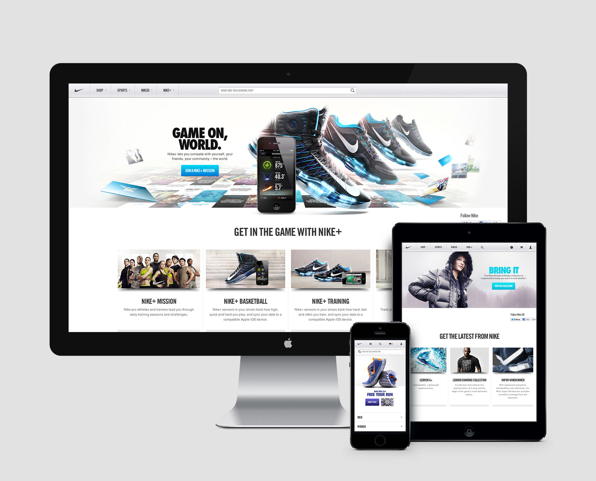
MOBILE SITE
I was one of two primary experience designers leading the creation of the nike.com mobile experience. Until our mobile launch in early 2013, there was no mobile-optimized nike.com site. We made a new mobile-friendly style and system to work across all pages of the site. We prioritized information that the user would need most in situations of browsing nike.com on the go or as a second screen. I worked closely with the visual design and tech teams to insure that the intended mobile experience was executed properly.
I also helped lead post-launch user testing. Collaborating with the testing company to create user testing protocol, being active and present during testing, and making final analysis documents.
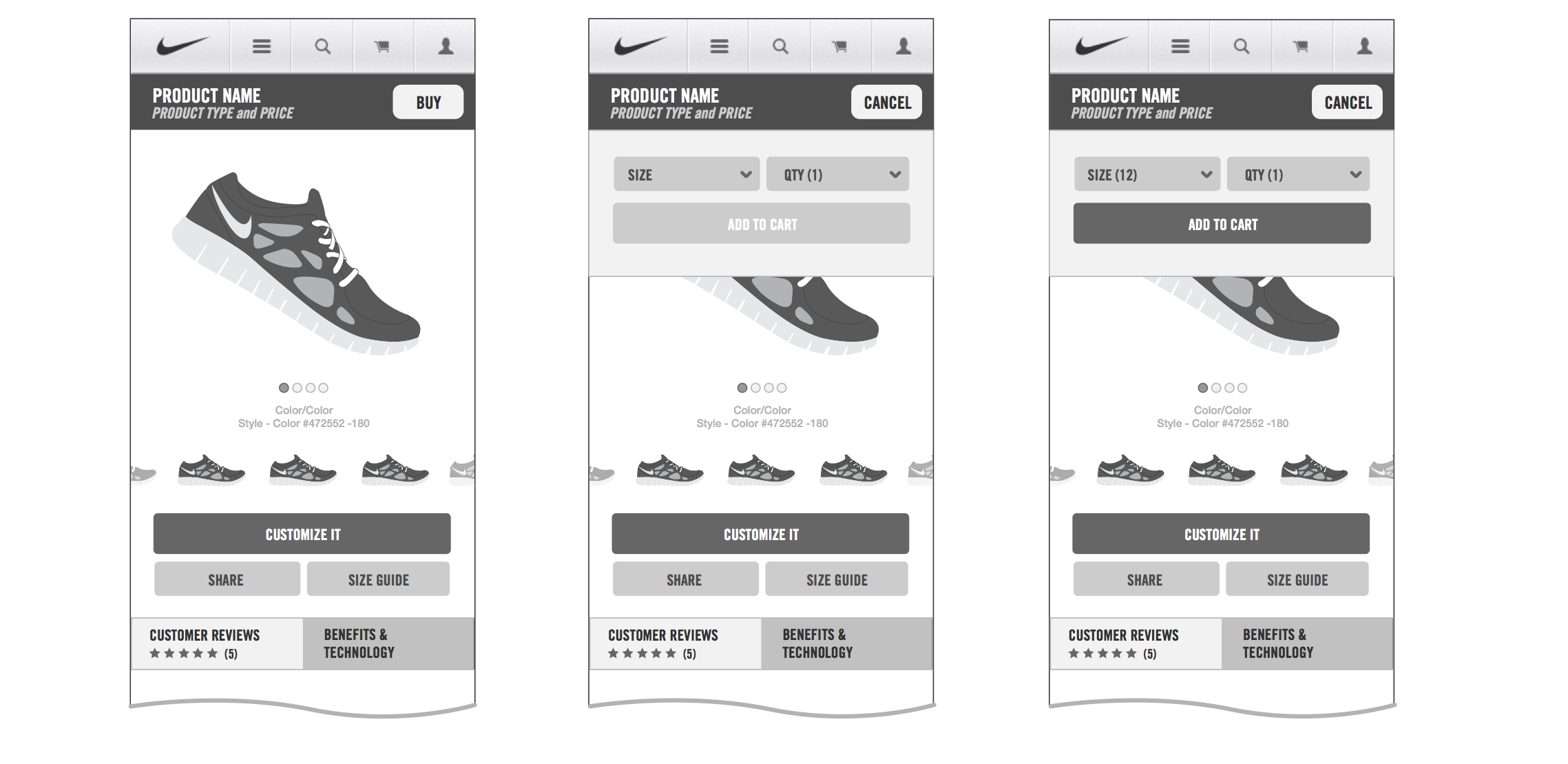
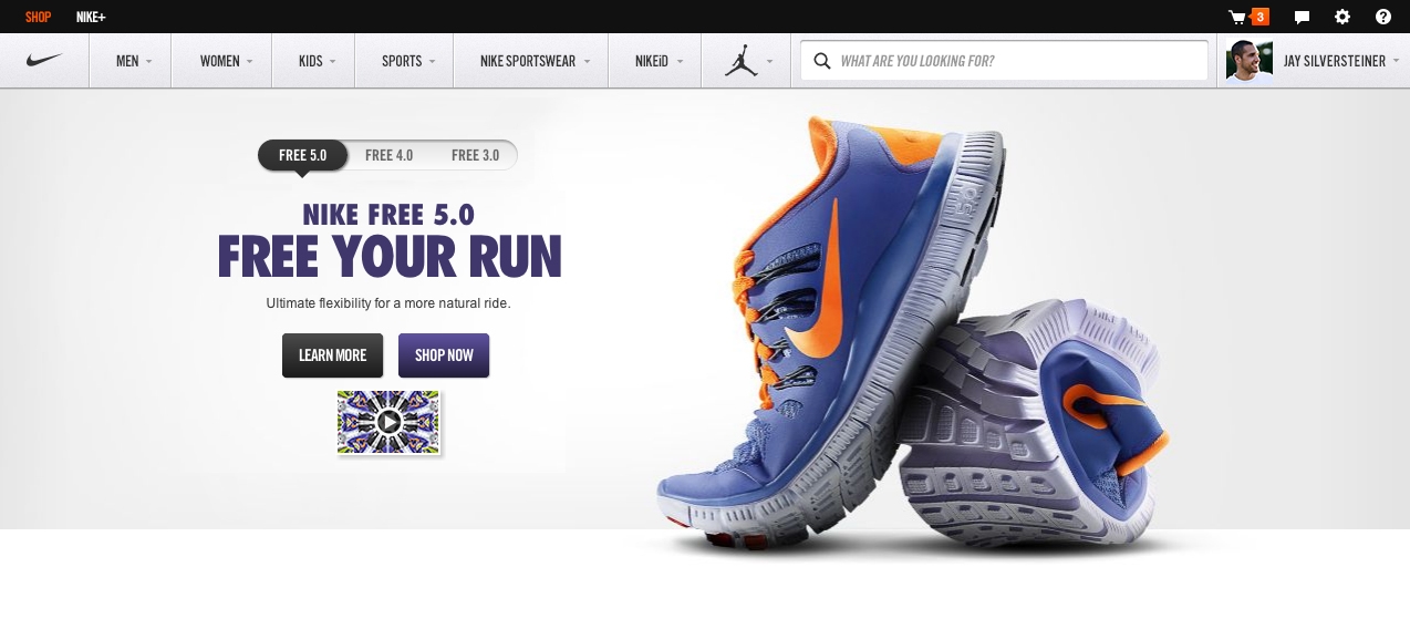
PRODUCT DETAIL PAGE RE-DESIGN
Nike requested a re-design of the nike.com product detail page. I was one of the lead experience designers working on this re-design. The larger Nike commerce team kicked off this re-design project with a shoot-out of new PDP ideas. We then combined a bit of all the best designs into our further iterations. However, through rounds of designs and user testing, we actually settled on a rather tame, traditional product detail page solution. While the final implementation is tamer than some of our original concepts, it has the user's needs at its core, keeps product photography the focus and makes product benefits easy to digest.

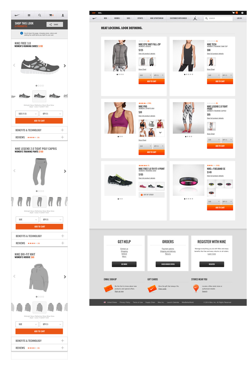
OUTFIT PRODUCT DETAIL PAGE
In tandem with the design of The Outfitter, my team also designed an outfit product detail page. This type of product detail page displays Nike products that make up an outfit. A user would access such a page from a look book gallery or photo of a model wearing an outfit on another page. The outfit PDP makes selecting individual components of an outfit simple, while still allowing users to see all items together. On the left, you see my wireframe for the mobile outfit detail page. At right, is a recent outfit detail page on nike.com.
SIZE & FIT GUIDE
When my visual designer partner and I began the size & fit guide project, Nike was getting countless calls a day, requesting further clarification on size and fit of products. This was no surprise to us considering the poorly designed, unresponsive, often inaccurate size & fit guides that were linked to from product pages. My partner and I started by taking a full inventory of all size & fit guides accessible on nike.com. We analyzed each one, identified the key information most needed by the user, and then proceeded to create an entirely new templated system for the size & fit guides, complete with a photography style guide.

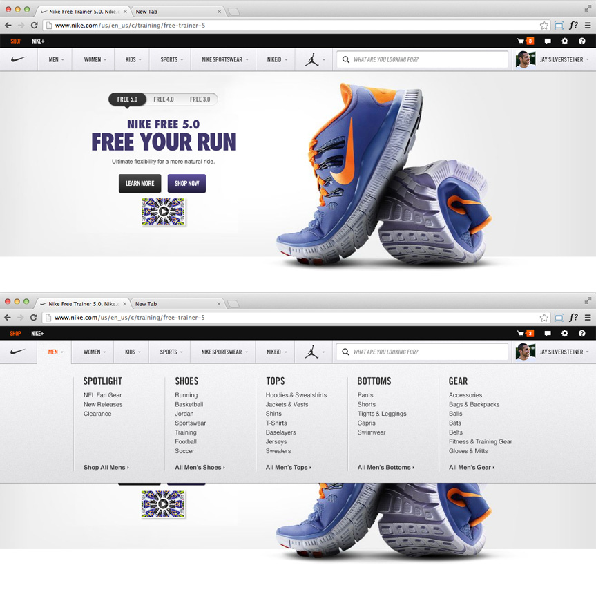
GLOBAL NAVIGATION RE-DESIGN
One of the last projects I completed for Nike was a re-design of the global navigation. Like the PDP, this re-design was driven by analytics and A/B testing results. Users wanted to dive deeper into categories faster and more easily, without have to navigate to another page level to do so. We worked with Nike to prioritize product categories most commonly accessed by users. The simple, but significant solution has pleased users and dramatically increased click-through rates.
Honors & Awards
D&AD Professional Awards / Branding, Digital Brand Expression - Yellow Pencil / 2013
One Show Interactive / UX Design / Information - Gold / 2013
One Show Interactive / Website, E-Commerce - Silver / 2013
Webby Awards / Best Shopping Experience / 2013
Art Directors Club Awards / Interactive (Website) - Silver / 2013
Art Directors Club Awards / Interactive (E-commerce) - Silver / 2013
Digiday Winner / Best Brand Platform / 2013
New York Festivals / Craft (Interface & Navigation) - Bronze / 2013
New York Festivals / Websites (Products & Services) - Bronze / 2013